Get a free quote
Thanks for getting in touch
Behind the Scenes: Making a splash for a drinks brand
As video producers specialising in Brand Films and Corporate communications, diversifying the types of videos we create is essential. Building a portfolio of work that resonates with our own interests and passions not only keeps us motivated but also allows us to showcase our versatility and creativity. Recently, Carl began exploring an interest in the world of food and drink, and we’re excited to share the story behind a speculative project he made for Mermaid Gin. Inspired by a bottle of Mermaid Gin.
Creative Vision
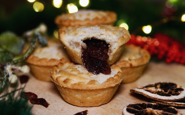
The idea for working on food and drink was fuelled by a long-standing passion for storytelling using props and sets. Each Christmas, I indulge in the tradition of making product shots of my favourite shop bought mince pies and sharing the images with a quick review on Instagram. This gave me the idea to explore something similar with video.
Inspiration struck unexpectedly at our staff Christmas party, where the design of the Mermaid Gin bottles caught my eye. The intricate texture resembling scales, particularly on the pink bottle, sparked my imagination. I envisioned vibrant, bold bright colours, lots of fruity summer vibes together with the elegant bottle design.
Planning and Pre-production
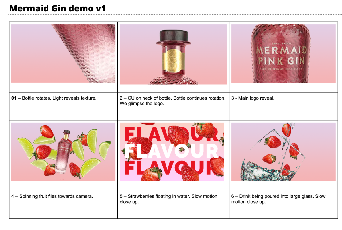
With the beautiful glass bottle selected, the next step was to create a detailed storyboard, taking inspiration from other ads I had seen and liked. It was here I worked out what colours worked better with which pieces of fruit and what onscreen text worked and where.
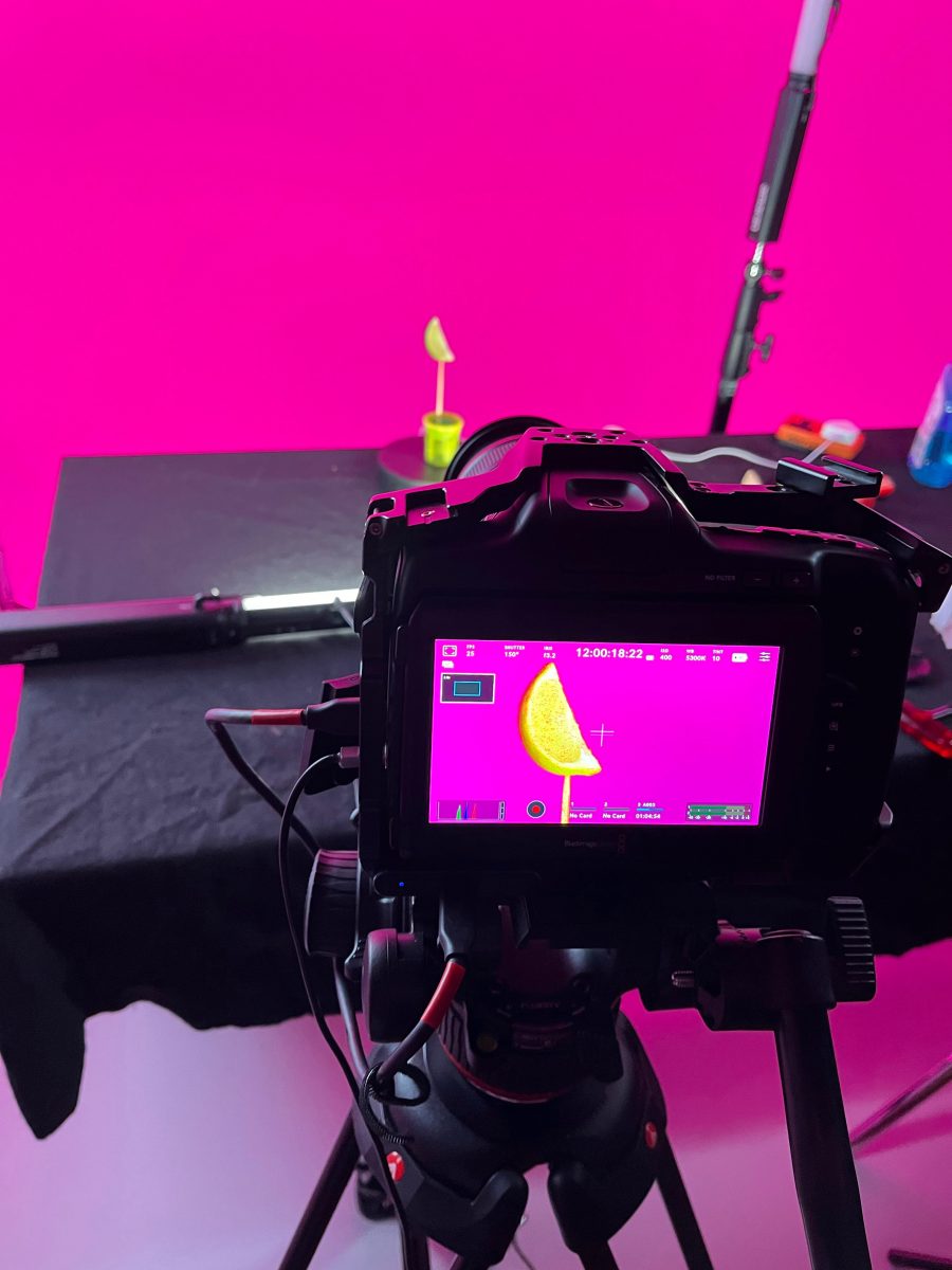
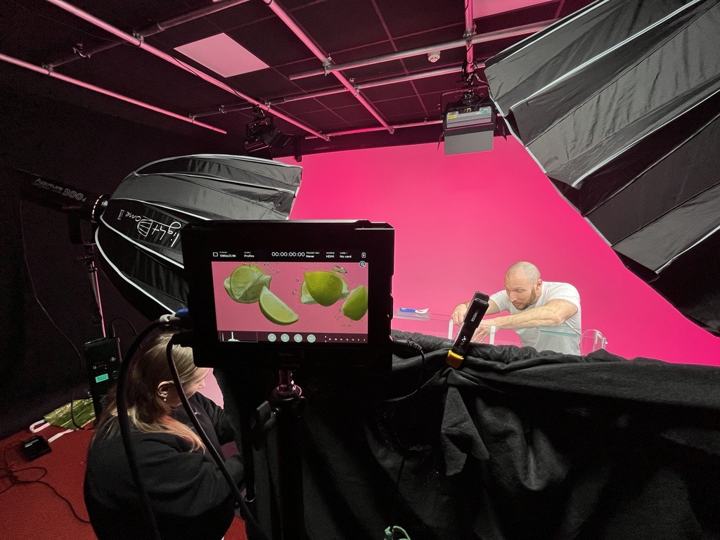
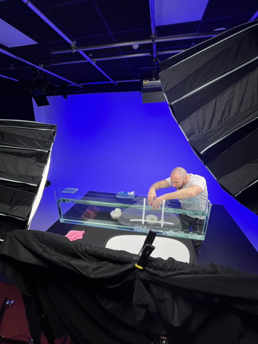
Ideally projects like this would require a brand manager and a food stylist but with this being more of a test of our capabilities in house, I opted to do this with the team at Videofrog – having the camera image on a large 50-inch screen really helped!
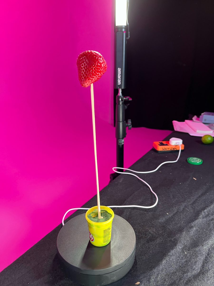
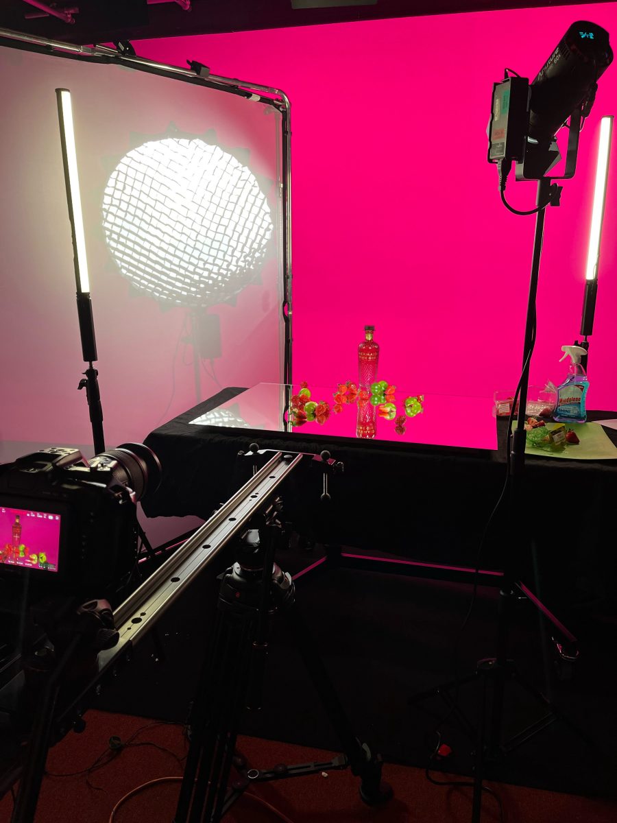
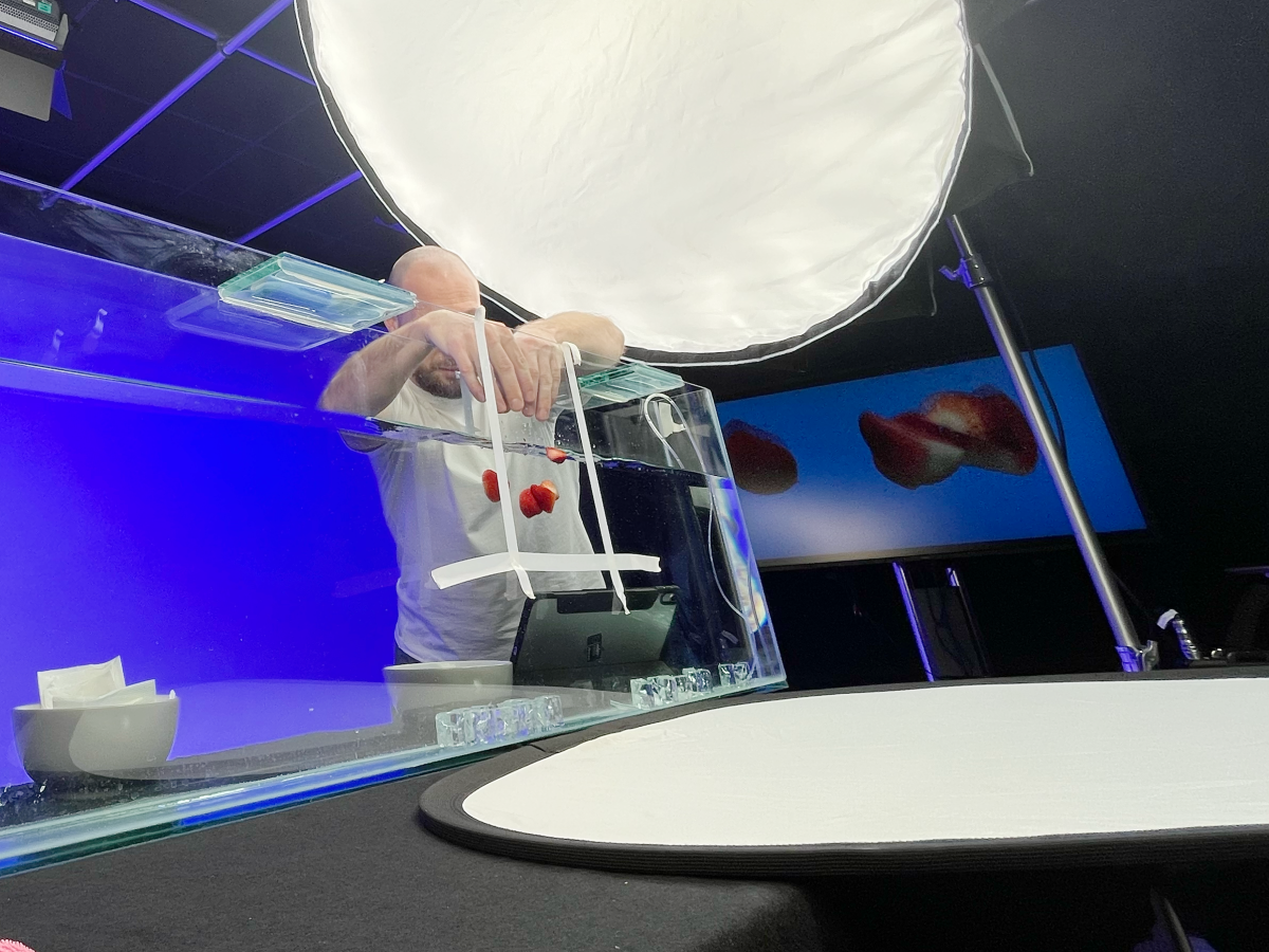
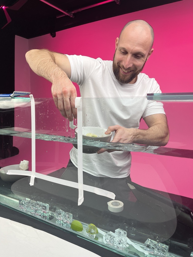
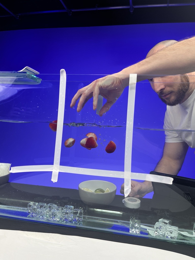
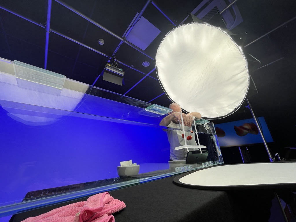
I wanted to show close ups of fruit floating inside a glass to represent the flavour of the drink so I opted to use a fish tank for this instead of shooting them in a small glass and because we have a large enough studio with running water and colour-controlled lights I thought this would give me lot of creative flexibility.
Production challenges and solutions
As with any form of filmmaking, there’s a lot of secrets to create the perfect shot! In this case, I thought that parts of the strawberries we’d bought weren’t red enough and so decided to use a red sharpie to fill in the less than perfect areas. One happy accident on the shoot was switching the small LED tube lights we were using to a slightly warmer orange colour for the close-ups of the bottle cap and print. This made the gold colours really pop out without making the rest of the product discoloured.

Editing and Post-Production.
With everything shot, I now needed to piece it together.
One of the key shots was the product bottle with fruit flying out from behind it, this was achieved by shooting each piece of fruit individually rotating and then compositing these into one shot.
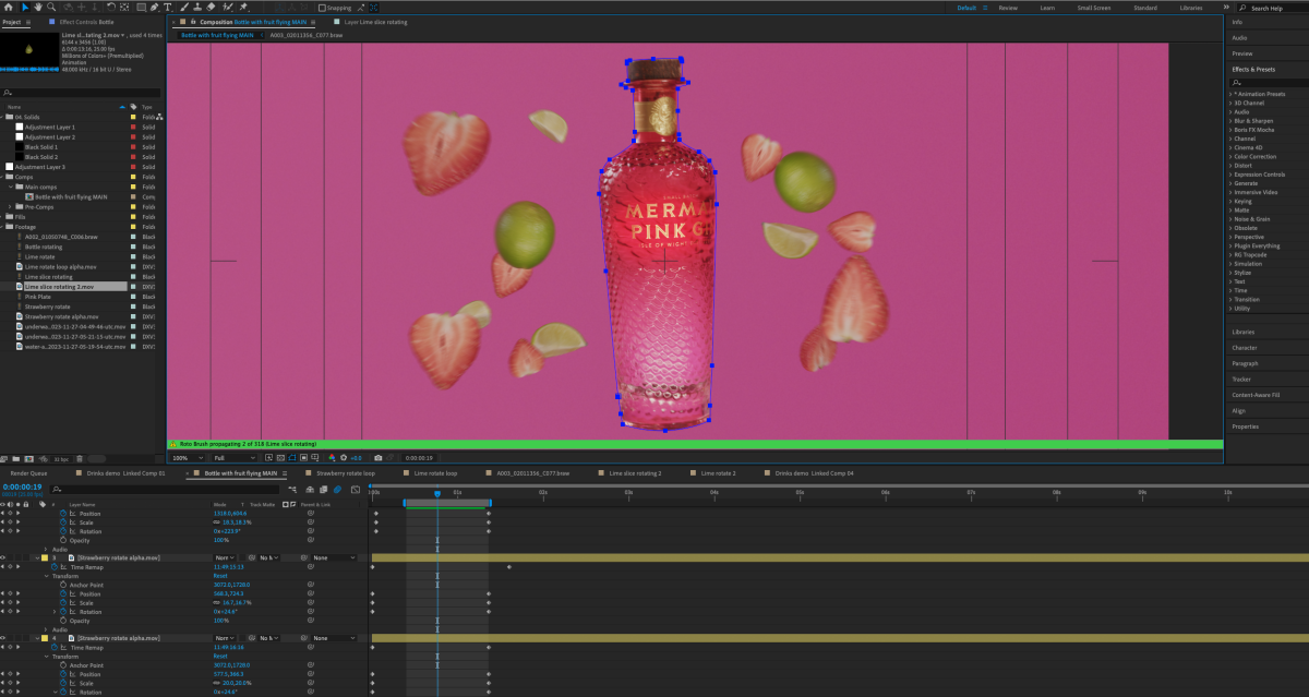
Next I graded the shots, enhancing the vibrant pinks, greens and blues to make this feel more energetic and the product more desirable.
The bright, visually striking imagery together with the floating fruit not only accentuated the brand’s connection to the ocean but also added a touch of elegance to the narrative.
When we aren’t working on current client projects, we are always looking for new ways to test the equipment and experiment with different avenues for our creative outlet.
This project was great fun to put together and I learnt a lot of new things in doing it, some of which I’m planning on putting into the next piece I want to work on…
Gallery